Every year, world paint manufacturers announce the colors that will be the trend for the coming year. And this year is no different. See what color Pantone, Dulux, WGSN, PPG, or Sherwin-Williams choose.
At the end of last year, the design world was shocked by the news of Very Peri, a color that the world famous Pantone Color Institute declared the color of 2022. However, the end of the year is approaching and these colors will be replaced by new shades. See which ones they are below.
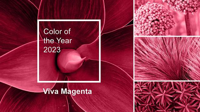
1. Viva Magenta by Pantone
After the last gray, luminous or ultraviolet coral, next year’s color according to Pantone will be magenta. Specifically, it’s a color called Viva Magenta with code 18-1750, which to the layman can be described as a darker burgundy red. Pantone attracted this color because of its naturalness and at the same time expressiveness that attracts attention. It is a shade rooted in nature that expresses strength. Viva Magenta is a bold, fearless, and vibrant color whose freedom celebrates joy and optimism.
Also read
2. Wild Wonders by Dulux
Dulux has opted for the Wild Wonder color for the upcoming year. It is a natural yellow that connects your home with the outdoors and makes you feel more at home. This calm yellow tone can serve as a neutral base for any room in the home and pairs well with different color tones. However, it works best with green, brown and soft purple tones.
3. Digital Lavender by Coloro and WGSN
According to WGSN, you can already see the color Digital Lavender in cyberspace. However, it will also appear in the real world next year. This shade is supposed to radiate stability, peace and well-being. Color represents a kind of digital escape that many of us have taken to keep our sanity and lock down.
4. Vining Ivy by PPG
The green-blue color of Vining Ivy (PPG1148-6) evokes a sense of calm and promotes equanimity. The dark, muted tones of Vining Ivy are meant to induce deep reflection, induce a sense of calm and turn our attention to ourselves. A bold yet cool color that straddles the line between bold blue and subtle green. In addition, the energetic and turquoise accents resemble precious stones. It will add uniqueness and elegance to any space.
5. Redend Point by Sherwin-Williams
Shade Redend Point is meant to express passion, warmth and empathy. It maintains an earthy neutral beige base, but with a pink undertone, it’s a fresh hue that will bring a warm, cheery vibe to your home. It can be used in the same way as Dulux’s Wild Wonder as a neutral base that matches earth tones.
Sources: Pantone.com, Dulux.cz
Also read
Also read
How to save dying houseplants?

“Certified bacon geek. Evil social media fanatic. Music practitioner. Communicator.”
